• Skip to primary navigation
  • Skip to main content
  • Skip to primary sidebar

5 Circles Research

  • Overview
  • SurveysAlaCarte
  • Full Service
  • About
  • Pricing Gurus
  • Events
  • Blog
  • Contact

Methodology

Leave a Comment

Why you should run statistical tests

A recent article in the Seattle Times covering a poll by Elway Research gives me an opportunity to discuss statistical testing. The description of the methodology indicates, as I’d expect, that the poll was conducted properly to achieve a representative sample:

About the poll: Telephone interviews were conducted by live, professional interviewers with 405 voters selected at random from registered voters in Washington state June 9-13. Margin of sampling error is ±5% at the 95% level of confidence.

That’s a solid statement. But what struck me was that the commentary, based on the chart I’m reproducing here, might seem inconsistent with the reliability statement above.
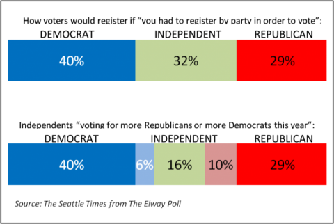
Chart of Elway Research Poll Results from Seattle Times

The accompanying text reads “More Washingtonians claim allegiance to Democrats than to Republicans, but independents are tilting more towards the GOP.” How can this be, when the difference is only 4% (6% more Democrats, 10% more Republicans)? The answer lies in how statistical testing works and the fact that statistical tests take into account the differences arising from different event probabilities.

First, let’s dissect the reliability statement. It means that results from this survey will be within ±5% of the true population, registered voters in this case, 19 out of 20 times if samples of this size were drawn from the registered voter list and surveyed. (One time in 20 the results could be outside of that ±5% range; that’s the result of sampling.) This ±5% range is actually the worst case and is only this high at for 50% event probabilities – meaning the situation where responses are likely to be equally split. Researchers use the worst case figure to ensure that they sample enough people for the desired reliability whatever the results are. In this case, the range for Independents leaning towards Democrats is ±2.3% (i.e. 3.7% to 8.3%) while the range for Independents leaning towards the GOP is ±2.9% (i.e. 7.9% to 12.9%). But these ranges overlap so how can the statement about tilting more to the Republicans be made with confidence?

We need to run statistical tests to apply more rigor to the reporting. In this case t-tests or z-tests will show the answer we need. The t-test is perhaps more commonly used because if works with smaller sample sizes, although we have a large enough sample here for either. Applying a t-test to the 6% and 10% results we find that the t-score is 2.02 which is greater than the 1.96 needed for 95% confidence. The differences in proportions are NOT likely due to random chance, and the statement is correct.
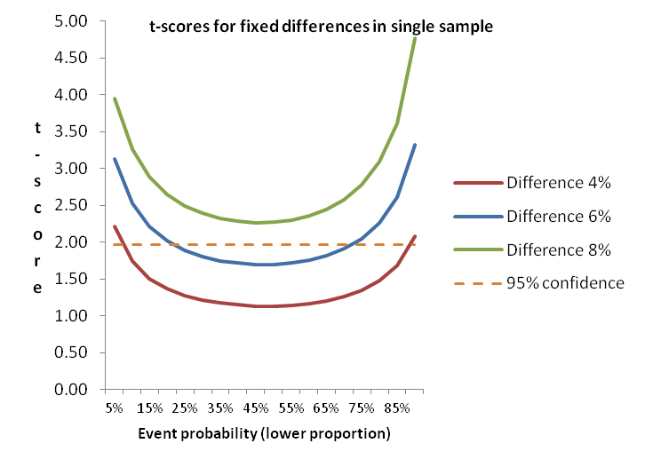
Chart of t-scores for small proportion differences

To illustrate the impact of event probability on statistical testing, this diagram shows how smaller differences in proportions are more able to discriminate differences as the event probability gets further away from the midpoint. Note that even at 6% difference results between about 20% and 70% (for the lower proportion) won’t generate a statistically significant difference, while at 8% difference the event probability doesn’t matter. Actually, 7% is sufficient – just.

Without using statistical testing, you won’t be sure that the survey results you see for small differences really mean that the groups in the surveyed population differ. How can you prioritize your efforts for feature A versus feature B if you don’t know what’s really important? Do your prospects differ in how they find information or make decisions to buy? You can create more solid insights and recommendations if you test.

Tools for statistical testing

The diagram above shows how things work, and is a rule of thumb for one type of testing. But it is generally best to use one or more tools to do significance testing.
Online survey tools don’t generally offer significance testing. The vendors tell me that users can get into trouble, and they don’t want to provide support. So you are need to find your own solutions. If you are doing analysis in Excel you can use t-tests and z-tests that are included in the Data Analysis Toolpak. But these only work on the individual results so if you are trying to look at aggregate proportions (as might be needed when using secondary research as I did above) you need a different tool. Online calculators are available from a number of websites, or you might want to download a spreadsheet tool (or build your own from the formulae). These tools are great for a quick check for a few data points without having to enter a full data set.

SPSS has plenty of tests available, so if you are planning on doing more sophisticated analysis yourself, or if you have a resource you use for advanced analysis then you’ll have the capability available. But SPSS, besides being expensive, isn’t all that efficient for large numbers of tests. I use SPSS for regressions, cluster analysis and the like, but I prefer having a set of crosstabs to be able to quickly spot differences between groups in the target population. We still outsource some of this work to specialists, but have found that most of full-service engagements include so we recently added WinCross to our toolbag. We are also making the capability available for our clients who subcontract to 5 Circles Research.

WinCross is a desktop package from The Analytical Group offering easy import from SPSS or other data formats. Output is available in Excel format, or as an RTF file for those who like a printed document (like me). With the printed output you can get up to about 25 columns in a single set (usually enough, but sometimes two sets are needed), with statistical testing across multiple combinations of columns. Excel output can handle up to 255 columns. There are all sorts of features for changing the analysis base, subtotals and more, all accessible from the GUI or by editing the job file to speed things up. It’s not the only package out there, but we like it, and the great support.

Conclusion

I hope I’ve convinced you of the power of statistical testing, and given you a glimpse of some of the tools available. Contact us if you are interested in having us produce crosstabs for your data.

Idiosyncratically,
Mike Pritchard
Filed Under: Methodology, News, Published Studies, Statistics Tagged With: News, Published Studies, statistical testing, Statistics

3 Comments

Poor question design means questionable results: A tale of a confusing scale

I saw the oddest question in a survey the other day. The question itself wasn’t that odd, but the options for responses were very strange to me.

  • 1 – Not at all Satisfied
  • 2 – Not at all Satisfied
  • 3 – Not at all Satisfied
  • 4 – Not at all Satisfied
  • 5 – Not at all Satisfied
  • 6 – Not at all Satisfied
  • 7 – Somewhat Satisfied
  • 8 – Somewhat Satisfied
  • 9 – Highly Satisfied
  • 10 – Highly Satisfied

What’s this all about?  As a survey taker I’m confused.  The question has a 10 point scale, but why does every numeric point have text (anchors). What’s the difference between 1, 2, 3, 4, 5 and 6 that all have the same anchoring text?   Don’t they care about the difference between 3 and 5?  Oh, I get it, this is really a 3 point scale disguised as a 10 point scale.

With these and other variations on the theme of “what were the survey authors thinking?”  on my mind I talked to a representative from the sponsoring company, AOTMP.  I was told that the question design was well-thought out and appropriate, being modeled on the well-known Net Promoter Score.   Well of course it is  – like an apple is based on an orange (both grow on trees).  But not really:

  • The Net Promoter question is for Recommendation, not Satisfaction.  There were a couple of other similar questions in the short survey, but nothing about Recommendation. Frederick Reichheld’s contention is that recommendation is the important measure and also incorporates satisfaction; you won’t recommend unless you are satisfied.
  • The NPS question uses descriptive text only at the end points (Extremely Unlikely to Recommend and Extremely Likely to Recommend).  It is part of the methodology to avoid text anywhere in the middle in order to give the survey taker the maximum flexibility.  That’s consistent with survey best practices.
  • The original NPS scale is from 0 to 10, not 1 to 10.  Maybe that’s a small point, although the 0 to 10 scale does allow for a midpoint which was part of the the NPS philosophy.

Other than the fact that this survey question isn’t NPS, what’s the big deal?  Well, this pseudo 10 point scale really doesn’t work.  The survey taker is likely to be confused about whether there is any difference between “3, Not at all Satisfied” and “4, Not at all Satisfied”. Perhaps the intention was to make it easier for survey takers, but either they’ll take more time worrying about the meaning, or just give an unthinking answer, and the survey administrator has no way of knowing.  Why not just use the 3 point scale instead?  I suppose you could, but then it would be even less like NPS. Personally, I like the longer scale for NPS.  I don’t use NPS on its own very much, but the ability to combine with other satisfaction measures with longer scales (Overall Satisfaction and Likelihood to Reuse) means that I’ve got the option of doing more powerful analysis as well as the simple NPS.  More importantly, I don’t have to try to persuade a client to stop using NPS as long as I include other questions using the same scale.  Ideally, I’d prefer to use a 7 or 5 point scale instead, but 10 or 11 points works fine – as long as only the end-points are anchored. For more on combining Net Promoter with other questions for more powerful analysis, check out “Profiting from customer satisfaction and loyalty research”

There’s no justification for this type of scale in my opinion.  If you disagree, please make a comment or send me a note.   If you want to use a scale with every point textually anchored, use the Likert scale with every point identified (but no numbers). Including both numbers and too many anchors will make the survey takers scratch their heads – not the goal for a good survey.

Perhaps the people who created this survey had read economist J.K. Galbraith’s comment without realizing it was sarcastic.- “It is a far, far better thing to have a firm anchor in nonsense than to put out on the troubled seas of thought.”

Idiosyncratically,
Mike Pritchard

Many thanks to Greg Weber of Priorities Research for clarifying the practice and the philosophy of the Net Promoter Score.

Filed Under: Methodology, Questionnaire Tagged With: Net Promoter, NPS, Questionnaire, Surveys

Leave a Comment

SurveyTip: Get to the point, but be polite

A survey should aim to be like a conversation.  Online surveys don’t have humans involved to listen to how someone feels about the survey, to reword for clarity or to encourage, so you have to work harder to generate comfort.  Although you don’t want to take too long (the number one complaint of survey takers is time), it is still better to work up to the key questions gradually if possible.  Even though it might be the burning issue for you, you risk turning someone off if you launch straight into the most important question. A few preliminary questions should also help put the respondent into the right frame of mind for the topic.

Generally, the best approach is to build up the intensity, starting from less important questions and then moving to the critical questions as quickly as possible, building up the survey taker’s engagement as you go.  Then reduce the intensity with clarifying questions and demographics.  That way, if someone bails out early, you’ll still have the most important information (assuming that your survey tool and/or your sample company allow you to look at partial surveys).

There are exceptions of course, and one comes from the use of online panels, particularly when you set up quotas and pay for completed surveys.  In this case, one or more demographic questions, used for screening, will be placed very early. 

Or sometimes the topic of the survey dictates the order, as with awareness studies where unaided awareness is usually one of the first questions.  You might also order the questions based on the survey logic. 

If you need to include a response from an earlier question in a later question (piping), or if the answer to one question will determine which other questions are asked (skip logic), this may impose a question order. 

For complex surveys, there are likely to be tradeoffs that are best decided by careful review of the questionnaire (as a document) before starting programming.  This is why questionnaire writing is a combination of experience and science with a little bit of guesswork thrown in for good measure.

One example of how a softer start helped was a survey for an organization considering new services.  The original questionnaire launched straight into the questions for the new services after a brief introduction.  Responses trickled in slowly.  When a question about membership in the organization was moved up to the beginning, the response rates jumped and we were able to complete the survey on time.

If you show respect for your survey takers, they’ll appreciate it and they’ll reward you by completing the entire survey.  Good luck!
Mike

Filed Under: Methodology, SurveyTip

61 Comments

Van Westendorp pricing (the Price Sensitivity Meter)

This is a follow up to classes I taught that included a short section on pricing research methodologies. I promised some more details on the Van Westendorp approach, in part because information available online may be confusing, or worse. This article is intended to be a practitioner’s guide for those conducting their own research.

First, a refresher. Van Westendorp’s Price Sensitivity Meter is one of a number of direct techniques to research pricing. Direct techniques assume that people have some understanding of what a product or service is worth, and therefore that it makes sense to ask explicitly about price. By contrast, indirect techniques, typically using conjoint or discrete choice analysis, combine the price with other attributes, ask questions about the total package, and then extract feelings about price from the results.

I prefer direct pricing techniques in most situations for several reasons:

  • I believe people can usually give realistic answers about price.
  • Indirect techniques are generally more expensive because of setup and analysis.
  • It is harder to explain the results of conjoint or discrete choice to managers or other stakeholders.
  • Direct techniques can be incorporated into qualitative studies in addition to their usual use in a survey.

Remember that all pricing research makes the assumption that people understand enough about the landscape to make valid comments. If someone doesn’t really have any idea about what they might be buying, the response won’t mean much regardless of whether the question is direct or the price is buried. Lack of knowledge presents challenges for radically new products. This aspect is one reason why pricing research should be treated as providing an input into pricing decisions, not a complete or absolute answer.

Other than Van Westendorp, the main direct pricing research methods are these:

  • Direct open-ended questioning (“How much would you pay for this”).  This is generally a bad way to ask, but you might get away with it at the end of a in-depth (qualitative) interview.
  • Monadic (“Would you be willing to buy at $10”). This method has some merits, including being able to create a demand curve with a large enough sample and multiple price points. But there are some problems, chief being the difficulty of choosing price points, particularly when the prospective purchaser’s view of value is wildly different from the vendor’s. Running a pilot might help, but you run the risk of having to throw away results from the pilot. But if you include open-ended questions for comments, and people tell you the suggested price is ridiculous, at least you’ll know why nobody wants to buy at the price you set in the pilot. Monadic questioning is pretty simple, but it is generally easy to do better without much extra work.
  • Laddering (“would you buy at $10”, then “would you buy at $8” or “would you still buy at $12”). Don’t even think about using this approach, as the results won’t tell you anything. The respondent will treat the series of questions as a negotiation rather than research. If you wanted to ask
    about different configurations the problem is even worse.
  • Van Westendorp’s Price Sensitivity Meter uses open-ended questions combining price and quality. Since there is an inherent assumption that price is a reflection of value or quality, the technique is not useful for a true luxury good (that is, when sales volume increases at higher prices). Peter Van Westendorp introduced the Price Sensitivity Meter in 1976 and it has been widely used since then throughout the market research industry.

How to set up and analyze using Van Westendorp questions

The actual text typically varies with the product or service being tested, but usually the questions are worded like this:

  • At what price would you think product is a bargain – a great buy for the money
  • At what price would you begin to think product is getting expensive, but you still might consider it?
  • At what price would you begin to think product is too expensive to consider?
  • At what price would you begin to think product is so inexpensive that you would question the quality and not consider it?

There is debate over the order of questions, so you should probably just choose the order that feels right to you. We prefer the order shown above.

The questions can be asked in-person, by telephone, on paper or (most frequently these days) online survey. In the absence of a human administrator who can assure comprehension and valid results, online or paper surveys require well-written instructions. You may want to emphasize that the questions are different and highlight the differences. Some researchers use validation to force the respondent to create the expected relationships between the various values, but if done incorrectly this can backfire (see my earlier post). If you can’t validate in real-time (some survey tools won’t support the necessary programming), then you’ll need to clean the data (eliminate inconsistent responses) before analyzing. Whether you validate or not, remember that the questions use open-ended numeric responses. Don’t make the mistake of imposing your view of the world by offering ranges.

Excel formulae make it easy to do the checking, but to simplify things for an eyeball check, make sure the questions are ordered in your spreadsheet as you would expect prices to be ranked, that is Too Cheap, Bargain, Getting Expensive, Too Expensive.

Ensure that the values are numeric (you did set up your survey tool to store values rather than text didn’t you? – if not another Excel manipulation is needed), and then create your formula like this:

IF(AND(TooCheap<=Bargain,Bargain<=GettingExpensive, GettingExpensive<=TooExpensive), OK, FAIL)

You should end up with something like this extract:

ID

Too Cheap

Bargain

GettingExpensive

TooExpensive

Valid

1

40

100

500

500

OK

2

1

99

100

500

OK

3

10

2000

70000

100

FAIL

4

0

30

100

150

OK

5

0

500

1000

1000

OK

Perhaps respondent 3 didn’t understand the wording of the questions, or perhaps (s)he didn’t want to give a useful response.  Either way, the results can’t be used.  If the survey had used real-time validation, the problem would have been avoided, but we might also have run the risk of annoying someone and causing them to terminate, potentially losing other useful data.  That’s not always an easy decision when you have limited sample available.

Now you need to analyze the valid data.  Van Westendorp results are displayed graphically for analysis, using plots of cumulative percentages. One way is using Excel’s Histogram tool to generate the values for the plots. You’ll need to set up the buckets,so it might be worth rank ordering the responses to get a good idea of the right buckets.  Or you might already have an idea of price increments that make sense.

Create your own buckets, otherwise the Excel Histogram tool will make its own from the data, but they won’t be helpful.

Just to make the process even more complicated, you will need to plot inverse cumulative distributions (1 minus the number from the Histogram tool) for two of the questions. Bargain is inverted to become “Not a Bargain” and Getting Expensive becomes “Not Expensive”.  Warning: if you search online you may find that plots vary, particularly in which questions are flipped. What I’m telling you here is my approach which seems to be the most common, and is also consistent with the Wikipedia article, but the final cross check is the vocalizing test, which we’ll get to shortly.

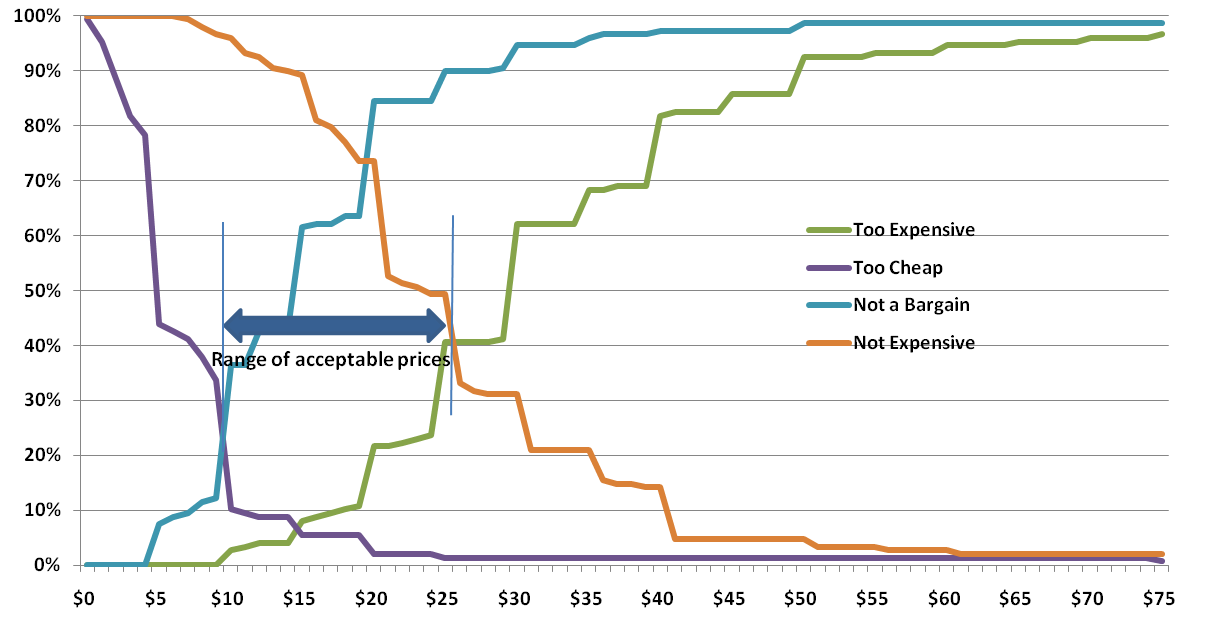
Van Westendorp example chart

Before we get to interpretation, let’s apply the vocalization test.  Read some of the results from the plots to see if everything makes sense intuitively.

“At $10, only 12% think the product is NOT a bargain, and at $26, 90% think it is NOT a bargain.”

“44% think it is too cheap at $5, but at $19 only 5% think it is too cheap.”

“At $30, 62% think it is too expensive, while 31% think it is NOT expensive – meaning 69% think it is getting expensve” (Remember these are cumulative – the 69% includes the 62%). Maybe this last one isn’t a good example of the vocalization check as you have to revert back to the non flipped version. But it is still a good check; more people will perceive something as getting expensive than too expensive.

Interpretation

Much has been written on interpreting the different intersections and the relationships between intersections of Van Westendorp plots. Personally, I think the most useful result is the Range of Acceptable Prices.   The lower bound is the intersection of Too Cheap and Expensive (sometimes called the point of marginal cheapness).  The upper bound is the intersection of Too Expensive and Not Expensive (the point of marginal expensiveness).  In the chart above, this range is from $10 to $25.  As you can see, there is a very significant perception shift below $10.  The size of the shift is partly accounted for by the fact that $10 is an even value.  People believe that $9.99 is very different from $10; even though this chart used whole dollar numbers, this effect is still apparent.  Although the upper intersection is at $25, the Too Expensive and Not Expensive lines don’t diverge much until $30.  In this case, anywhere between $25 and $30 for the upper bound would probably make little difference – at least before testing demand.

Some people think the so-called optimal price (the intersection of Too Expensive and Too Cheap) is useful, but I think there is a danger of trying to create static perfection in a dynamic world, especially since pricing research is generally only one input to a pricing decision. For more on the overall discipline of pricing, Thomas Nagle’s book is a great source.

Going beyond Van Westendorp’s original questions

As originally proposed, the Van Westendorp questions provide no information about willingness to purchase, and thus nothing about expected revenue or margin.

To provide more insight into demand and profit, we can add one or two more questions.

The simple approach is to add a single question along the following lines:

At a price between the price you identified as ‘a bargain’ and the price you said was ‘getting expensive’, how likely would you be to purchase?

With a single question, we’d generally use a Likert scale response (Very unlikely, Unlikely, Unsure, Likely, Very Likely) and apply a model to generate an expected purchase likelihood at each point. The model will probably vary by product and situation, but let’s say 70% of Very Likely + 50% of Likely as a starting point. It is generally better to be conservative and assume that fewer will actually buy than tell you they will, but there is no harm in using what-ifs to plan in case of a runaway success, especially if there is a manufacturing impact.

A more comprehensive approach is to ask separate questions for the ‘bargain’ and ‘getting expensive’ prices, in this case using percentage responses.  The resulting data can be turned into demand/revenue curves, again based on modeled assumptions or what-ifs for the specific situation.

Conclusion

Van Westendorp pricing questions offer a simple, yet powerful way to incorporate price perceptions into pricing decisions.  In addition to their use in large scale surveys described here, I’ve used these questions for in-depth interviews and focus groups (individual responses followed by group discussion).

Idiosyncratically,

Mike Pritchard

References:

Wikipedia article: http://en.wikipedia.org/wiki/Van_Westendorp’s_Price_Sensitivity_Meter

The Strategy and Tactics of Pricing, Thomas Nagle, John Hogan, Joseph Zale, is the standard pricing reference. The fifth edition contains a new chapter on price implementation and several updated examples on pricing challenges in today’s markets.

Or you can buy an older edition to save money. Search for Thomas Nagle pricing

Pricing with Confidence, Reed Holden.

The Price Advantage, Walter Baker, Michael Marn, Craig Zawada.

Van-Westendorp PH,(1976), NSS Price Sensitivity Meter – a new approach to the study of consumer perception of price. Proceedings of the 29th Congress, Venice ESOMAR

Filed Under: Featured Posts, Methodology, Pricing Tagged With: pricing, Van Westendorp

Leave a Comment

Time to cool it? (your tea that is)

As a tea-drinking Brit I was fascinated by a study about tea drinking in Northern Iran concluding that drinking very hot tea is strongly associated with higher risk of oesophageal cancer.

Digging in further, I was struck by a number of points:

  • The article I first noticed, by Karen Kaplan of the Los Angeles Times, was very clearly written and didn’t mangle the facts or interpretations. Such clarity is unusual and deserves a commendation. Read the article for the details – I don’t need to repeat.
  • The scale of the study was unusually large compared with many medical studies, including some that draw dubious conclusions from a very small data set. The research team (from England, France, Sweden and the U.S.) matched 300 cancer patients with 571 healthy controls who had similar demographics. These groups are only a small fraction of the entire database of nearly 50,000 people in Golestan province whose tea drinking habits have been studied, so we can expect future refinement and expansion of results.
  • The original article in the BMJ (formerly the British Medical Journal), BMJ 2009;338:b929, is a well-written source document, complete with properly explained tables and a video.

This is a good example of a well researched and reported project. The results are made available under an open access Collective Commons License, that doubtless encourages completeness.

After evaluating the details, I decided to review my own tea and coffee rituals. The study concluded that the most likely causal mechanism is the temperature, so regardless of what hot liquid you drink it might be a good to be cautious about temperature. I don’t drink anywhere near the quantity of hot liquids that the study participants imbibe daily (nearly 1.2 liters on average – that’s over 2.1 British pints or 2.5 U.S. pints), but the damage may be cumulative and I want to be a tea drinker for many more years. It seems that my latte drinks are cool enough, but I should probably wait for a few minutes after brewing to drink my tea at around 140 degrees Fahrenheit. Perhaps I’ll start to put the tea cosy on after the first cup, but I don’t think I can bring myself to stop warming the teapot. My wife is the smart one – she’s always preferred to cool down her tea with water from the tap.

Idiosyncratically,
Mike Pritchard

Filed Under: Methodology, Reporting, Statistics

2 Comments

Profiting from customer satisfaction and loyalty research

Business people generally believe that satisfying customers is a good thing, but they don’t necessarily understand the link between satisfaction and profits. This is partly because much of the original work was done so long ago that contradictory cases and nuances have allowed confusion to build up. Additionally, some companies have appeared successful for a time despite poor satisfaction, generally in industries where there is limited or no competition such as airlines.

[Read more…] about Profiting from customer satisfaction and loyalty research

Filed Under: Customer Satisfaction, Featured Posts, Methodology, Surveys Tagged With: loyalty, Net Promoter, NPS, satisfaction, Surveys

  • « Go to Previous Page
  • Go to page 1
  • Go to page 2
  • Go to page 3
  • Go to Next Page »

Primary Sidebar

Follow us on LinkedIn Subscribe to Blog via RSS Subscribe to Blog via Email
Great workshop! You know this field cold, and it’s refreshing to see someone focused on research for entrepreneurs.
Maria RossOwnerRed Slice
First, I thought it was near impossible to obtain good market information without a large scale, complex market study. Working with 5 Circle Research changed that. We were able to put together a comprehensive survey that provided essential information the company was looking for. It started with general questions gradually evolving to specifics in a fast pace, fun to take questionnaire. Introducing “a new way of doing things” like Revollex’ induction heating-susceptor technology can be challenging. The results provided critical data to help understand the market demand. High quality work, regard for schedule, thorough understanding of the issues are just a few aspects of an overall exceptional experience.
Robert PoltCEORevollex.com
What we were doing was offering not just a new product, but a new market niche. We needed to understand traditional markets well to characterize the new one. Most valuable was 5 Circles ability to gather research data and synthesize it.
Will NeuhauserPresident Chorus Systems Inc.
When you work with a market research company you normally have to define the questions. 5 Circles Marketing’s staff have technical backgrounds, so it’s a lot easier to work with them.
Lorie WigleProduct Line Manager, Business Communications DivisionIntel Corporation
Since becoming our contracted consultant for market research services in 2010, 5 Circles Research has revolutionized our annual survey of consumer opinion in Washington. Through the restructuring of survey methodology and the application of new analytical tools, they have provided insights that are both wider in their scope and deeper in their relevance for understanding consumer values and behavior. As a result, the survey has increased its significance as a planning and evaluation tool for our entire state agency. 5 Circles does great work!
Blair ThompsonDirector of Consumer CommunicationsWashington Dairy Products Commission
Every conversation with Mike gave me new insight and useful marketing ideas. 5 Circles’s report was invaluable in deciding on the viability of our new product idea.
Greg HowePresidentCD ROM Library, Inc.
You know how your mechanic knows what’s wrong with your car when you just tell them what it sounds like over the phone? Well, my first conversation with Mike was like that — in like 10 seconds, he gave me an insight into my market research that was something I’d been struggling trying to figure out. A class like this will help you learn what you can do on your own. And, you’ll have a better idea of what a research vendor can do for you.
Roy LebanFounder and CTOPuzzazz
Mike did multiple focus groups for me when I was at Amazon, and I was extremely pleased with the results. Not only is Mike an excellent facilitator, he also really understood the business problem and the customer experience challenges, and that got us to excellent and very actionable results.
Werner KoepfSenior ManagerAmazon.com
I hired Mike to develop, execute and report on a market research project involving a potential business opportunity. I was impressed with his ability to learn the industry and subsequently develop a framework for the market research project. He was able to execute the research and collect data efficiently and effectively. Throughout the project, he kept me abreast of the progress to allow for any adjustments as needed. The quality and quantitative output of the results exceeded my expectations and provided me with more confidence in the direction of the business opportunity.
Mike ClaudioVice President Marketing and Business DevelopmentWizard InternationalSeattle
Many thanks to you for the very helpful presentation on pricing last night. I found it extremely useful and insightful. Well worth the drive down from Bellingham!
G.FarkasCEOTsuga Engineering

Featured Posts

Dutch ovens: paying a lot more means better value

An article on Dutch ovens in the September/October 2018 of Cook’s Illustrated gives food for thought (pun intended) about the relationship of between price and value. Sometimes higher value for a buyer means paying a lot more money – good news for the seller too. Dutch ovens (also known as casseroles or cocottes) are multipurpose, [Read More]

Profiting from customer satisfaction and loyalty research

Business people generally believe that satisfying customers is a good thing, but they don’t necessarily understand the link between satisfaction and profits. [Read More]

Customer satisfaction: little things can make a big difference

Unfulfilled promises by the dealer and Toyota of America deepen customer satisfaction pothole. Toyota of America and my local dealer could learn a few simple lessons about vehicle and customer service. [Read More]

Are you pricing based on cost rather than value? Why?

At Pricing Gurus, we believe that value-based pricing allows companies to achieve higher profitability and a better competitive position. Some companies disagree with that perspective, or feel they are stuck with cost-based pricing. Let’s explore a few reasons why value-based pricing is generally superior. [Read More]

Recent Comments

  • Mike Pritchard on Van Westendorp pricing (the Price Sensitivity Meter)
  • Marshall on Van Westendorp pricing (the Price Sensitivity Meter)
  • Manik Balaam on Dutch ovens: paying a lot more means better value
  • 📕 E mail remains to be the most effective SaaS advertising channel; Chilly emails that work for B2B; Figuring out how it is best to worth… - hapidzfadli on Van Westendorp pricing (the Price Sensitivity Meter)
  • Soumyak on Van Westendorp pricing (the Price Sensitivity Meter)

Categories

  • Overview
  • Contact
  • Website problems or comments
Copyright © 1995 - 2025, 5 Circles Research, All Rights Reserved