• Skip to primary navigation
  • Skip to main content
  • Skip to primary sidebar

5 Circles Research

  • Overview
  • SurveysAlaCarte
  • Full Service
  • About
  • Pricing Gurus
  • Events
  • Blog
  • Contact

Pricing Gurus and 5 Circles Research Blog Posts

Top holiday business activities

We asked entrepreneurs, consultants and small business owners how they were spending their time over the holiday period.

Top Holiday Business Activities: 2010 year end

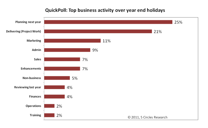
The question asked about the TOP activity, so people needed to prioritize. The most popular answers were “planning next year“, and “delivering to customers“, recognizing both looking forward and (presumably) the need to complete tasks. It would be interesting to see if planning is as popular at a time of the year when New Year isn’t a factor. Reviewing last year wasn’t as common as response. Perhaps people are doing continual reviews (I doubt it), or more likely they have recognized the need and the opportunity for bigger shifts and looking back isn’t as relevant.

An expert in collaborative strategy planning, Robert Nitschke of Arago Partners, tells me that many companies take until the end of Q1 to complete their strategic plan for the year. When will yours be done?

Idiosyncratically,
Mike Pritchard

Filed Under: Fun, Surveys Tagged With: QuickPoll, Surveys

Impact of cell phones on 2010 Midterms and beyond politics

Whether you are a political junkie or not, recent articles and analysis about mobile phones as part of data collection should be of interest to those who design or commission survey research. Cost, bias, and predictability are key issues.

In years gone by, cell phone users were rarely included in surveys. There was uncertainty about likely reaction of potential respondents (“why are you calling me on my mobile when I have to pay for incoming calls?”, “is this legal?”). Although even early on surveyors were nervous about introducing bias through not including younger age groups, studies showed that there were only insignificant differences beyond those associated with technology. When cell phone only households were only 7% researchers tended to ignore them. Besides, surveying via cell phone cost more, due to requirements that auto-dialing techniques couldn’t be used, increased rejection rates, compensating survey takers to compensate for their costs, and also a need for additional screening to reduce the likelihood of someone taking the survey from an unsafe place. Pew Research Center’s landmark 2006 study focused on cell phone usage and related attitudes, but also showed that the Hispanic population was more likely to be cell phone only.

Over the course of the next couple of years, Pew conducted several studies (e.g. http://people-press.org/report/391/the-impact-of-cell-onlys-on-public-opinion-polling ) showing that there was little difference in political attitudes between samples using landline only and those using cell phones. At the same time, Pew pointed out that other non-political attitudes and behaviors (such as health risk behaviors) differed between the two groups. They also noted that cell phone only households had reached 14% in December 2007. Furthermore, while acknowledging the impact of cost, Pew studies also commented on the value of including cell phone sampling in order to reach certain segments of the population (low income, younger). What’s Missing from National RDD Surveys? The Impact of the Growing Cell-Only Population.

Time marches on. Not surprisingly give the studies above, for more and more research, cell phone sample is now being included. With cell phone only households now estimated at upwards of 25% this increasingly makes sense. But not apparently for most political polls, despite criticism. The Economist, in an article October 7, 2010, http://www.economist.com/node/17202427 summarizes the issues well. Cost of course is one factor, but this impacts different polling firms and types differently. Pollsters relying on robocalling (O.K. IVR or Interactive Voice Response if you don’t want to associate these types of polls with assuredly partisan phone calls), are particularly affected by cost considerations. Jay Leve of SurveyUSA estimates costs would double for firms to change from automated calling to human interviewers as would be needed to call cell phones. And as the percentage of cell phone only households varies across states, predictability is even less likely. I suspect that much of this is factored into Nate Silver’s assessments on his FiveThirtyEight blog,  but he is also critical of the pollsters for introducing bias (http://fivethirtyeight.blogs.nytimes.com/2010/10/28/robopolls-significantly-more-favorable-to-republicans-than-traditional-surveys/ ). Silver holds Rasmussen up as having a Republican bias due to their methodology, and recently contrasted Rasmussen results here in Washington State with Elway (a local pollster using human interviewers) who has a Democratic bias according to FiveThirtyEight.

I’ve only scratched the surface of the discussion. We are finally seeing some pollsters incorporating cell phones into previously completely automated polls and this trend will inevitably increase as respondents are increasingly difficult to reach via landlines. Perhaps the laws will change to allow automated connections to cell phones, but I don’t see this in the near future given the recent spate of laws to deter use while driving.

But enough of politics. I’m fed up with all the calls (mostly push, only a few surveys) because apparently my VOIP phone still counts as a landline. Still, I look forward to dissecting the impact of cell phones after the dust has settled from November 2nd.

What’s the impact for researchers beyond the political arena?

  • If your survey needs a telephone data collection sample for general population, you’d better consider including cell phone users despite the increased cost. Perhaps you can use a small sample to assess bias or representativeness, but weighting alone will leave unanswered questions without some current or recent data for comparison.
  • Perhaps it’s time to use online data collection for all or part of your sample. Online (whether invitations are conducted through panels, river sampling, or social media) may be a better way to reach most of the cell phone only people. Yes, it’s true that the online population doesn’t completely mirror the overall population, but differences are decreasing and it may not matter much for your specific topic. Recent studies I’ve conducted confirm that online panelists aren’t all higher income, broadband connected, younger people. To be sure, certain groups are less likely to be online, but specialist panels can help with, for example, Hispanic people.

The one thing you can’t do is to ignore the cell phone only households.

By the way, if you are in the Seattle area, you might be interested in joining me at the next Puget Sound Research Forum luncheon on November 18, when REI will present the results of research comparing results from landline, cell phone and online panel sample for projectability.  http://pugetsoundresearchforum.org/

Good luck with your cell phone issues!

Idiosyncratically,

Mike Pritchard

Filed Under: Methodology, News, Published Studies, Surveys Tagged With: News, Published Studies, statistical testing, Statistics

Why you should run statistical tests

A recent article in the Seattle Times covering a poll by Elway Research gives me an opportunity to discuss statistical testing. The description of the methodology indicates, as I’d expect, that the poll was conducted properly to achieve a representative sample:

About the poll: Telephone interviews were conducted by live, professional interviewers with 405 voters selected at random from registered voters in Washington state June 9-13. Margin of sampling error is ±5% at the 95% level of confidence.

That’s a solid statement. But what struck me was that the commentary, based on the chart I’m reproducing here, might seem inconsistent with the reliability statement above.

Chart of Elway Research Poll Results from Seattle Times

The accompanying text reads “More Washingtonians claim allegiance to Democrats than to Republicans, but independents are tilting more towards the GOP.” How can this be, when the difference is only 4% (6% more Democrats, 10% more Republicans)? The answer lies in how statistical testing works and the fact that statistical tests take into account the differences arising from different event probabilities.

First, let’s dissect the reliability statement. It means that results from this survey will be within ±5% of the true population, registered voters in this case, 19 out of 20 times if samples of this size were drawn from the registered voter list and surveyed. (One time in 20 the results could be outside of that ±5% range; that’s the result of sampling.) This ±5% range is actually the worst case and is only this high at for 50% event probabilities – meaning the situation where responses are likely to be equally split. Researchers use the worst case figure to ensure that they sample enough people for the desired reliability whatever the results are. In this case, the range for Independents leaning towards Democrats is ±2.3% (i.e. 3.7% to 8.3%) while the range for Independents leaning towards the GOP is ±2.9% (i.e. 7.9% to 12.9%). But these ranges overlap so how can the statement about tilting more to the Republicans be made with confidence?

We need to run statistical tests to apply more rigor to the reporting. In this case t-tests or z-tests will show the answer we need. The t-test is perhaps more commonly used because if works with smaller sample sizes, although we have a large enough sample here for either. Applying a t-test to the 6% and 10% results we find that the t-score is 2.02 which is greater than the 1.96 needed for 95% confidence. The differences in proportions are NOT likely due to random chance, and the statement is correct.

Chart of t-scores for small proportion differences

To illustrate the impact of event probability on statistical testing, this diagram shows how smaller differences in proportions are more able to discriminate differences as the event probability gets further away from the midpoint. Note that even at 6% difference results between about 20% and 70% (for the lower proportion) won’t generate a statistically significant difference, while at 8% difference the event probability doesn’t matter. Actually, 7% is sufficient – just.

Without using statistical testing, you won’t be sure that the survey results you see for small differences really mean that the groups in the surveyed population differ. How can you prioritize your efforts for feature A versus feature B if you don’t know what’s really important? Do your prospects differ in how they find information or make decisions to buy? You can create more solid insights and recommendations if you test.

Tools for statistical testing

The diagram above shows how things work, and is a rule of thumb for one type of testing. But it is generally best to use one or more tools to do significance testing.
Online survey tools don’t generally offer significance testing. The vendors tell me that users can get into trouble, and they don’t want to provide support. So you are need to find your own solutions. If you are doing analysis in Excel you can use t-tests and z-tests that are included in the Data Analysis Toolpak. But these only work on the individual results so if you are trying to look at aggregate proportions (as might be needed when using secondary research as I did above) you need a different tool. Online calculators are available from a number of websites, or you might want to download a spreadsheet tool (or build your own from the formulae). These tools are great for a quick check for a few data points without having to enter a full data set.

SPSS has plenty of tests available, so if you are planning on doing more sophisticated analysis yourself, or if you have a resource you use for advanced analysis then you’ll have the capability available. But SPSS, besides being expensive, isn’t all that efficient for large numbers of tests. I use SPSS for regressions, cluster analysis and the like, but I prefer having a set of crosstabs to be able to quickly spot differences between groups in the target population. We still outsource some of this work to specialists, but have found that most of full-service engagements include so we recently added WinCross to our toolbag. We are also making the capability available for our clients who subcontract to 5 Circles Research.

WinCross is a desktop package from The Analytical Group offering easy import from SPSS or other data formats. Output is available in Excel format, or as an RTF file for those who like a printed document (like me). With the printed output you can get up to about 25 columns in a single set (usually enough, but sometimes two sets are needed), with statistical testing across multiple combinations of columns. Excel output can handle up to 255 columns. There are all sorts of features for changing the analysis base, subtotals and more, all accessible from the GUI or by editing the job file to speed things up. It’s not the only package out there, but we like it, and the great support.

Conclusion

I hope I’ve convinced you of the power of statistical testing, and given you a glimpse of some of the tools available. Contact us if you are interested in having us produce crosstabs for your data.

Idiosyncratically,
Mike Pritchard

Filed Under: Methodology, News, Published Studies, Statistics Tagged With: News, Published Studies, statistical testing, Statistics

Poor question design means questionable results: A tale of a confusing scale

I saw the oddest question in a survey the other day. The question itself wasn’t that odd, but the options for responses were very strange to me.

  • 1 – Not at all Satisfied
  • 2 – Not at all Satisfied
  • 3 – Not at all Satisfied
  • 4 – Not at all Satisfied
  • 5 – Not at all Satisfied
  • 6 – Not at all Satisfied
  • 7 – Somewhat Satisfied
  • 8 – Somewhat Satisfied
  • 9 – Highly Satisfied
  • 10 – Highly Satisfied

What’s this all about?  As a survey taker I’m confused.  The question has a 10 point scale, but why does every numeric point have text (anchors). What’s the difference between 1, 2, 3, 4, 5 and 6 that all have the same anchoring text?   Don’t they care about the difference between 3 and 5?  Oh, I get it, this is really a 3 point scale disguised as a 10 point scale.

With these and other variations on the theme of “what were the survey authors thinking?”  on my mind I talked to a representative from the sponsoring company, AOTMP.  I was told that the question design was well-thought out and appropriate, being modeled on the well-known Net Promoter Score.   Well of course it is  – like an apple is based on an orange (both grow on trees).  But not really:

  • The Net Promoter question is for Recommendation, not Satisfaction.  There were a couple of other similar questions in the short survey, but nothing about Recommendation. Frederick Reichheld’s contention is that recommendation is the important measure and also incorporates satisfaction; you won’t recommend unless you are satisfied.
  • The NPS question uses descriptive text only at the end points (Extremely Unlikely to Recommend and Extremely Likely to Recommend).  It is part of the methodology to avoid text anywhere in the middle in order to give the survey taker the maximum flexibility.  That’s consistent with survey best practices.
  • The original NPS scale is from 0 to 10, not 1 to 10.  Maybe that’s a small point, although the 0 to 10 scale does allow for a midpoint which was part of the the NPS philosophy.

Other than the fact that this survey question isn’t NPS, what’s the big deal?  Well, this pseudo 10 point scale really doesn’t work.  The survey taker is likely to be confused about whether there is any difference between “3, Not at all Satisfied” and “4, Not at all Satisfied”. Perhaps the intention was to make it easier for survey takers, but either they’ll take more time worrying about the meaning, or just give an unthinking answer, and the survey administrator has no way of knowing.  Why not just use the 3 point scale instead?  I suppose you could, but then it would be even less like NPS. Personally, I like the longer scale for NPS.  I don’t use NPS on its own very much, but the ability to combine with other satisfaction measures with longer scales (Overall Satisfaction and Likelihood to Reuse) means that I’ve got the option of doing more powerful analysis as well as the simple NPS.  More importantly, I don’t have to try to persuade a client to stop using NPS as long as I include other questions using the same scale.  Ideally, I’d prefer to use a 7 or 5 point scale instead, but 10 or 11 points works fine – as long as only the end-points are anchored. For more on combining Net Promoter with other questions for more powerful analysis, check out “Profiting from customer satisfaction and loyalty research”

There’s no justification for this type of scale in my opinion.  If you disagree, please make a comment or send me a note.   If you want to use a scale with every point textually anchored, use the Likert scale with every point identified (but no numbers). Including both numbers and too many anchors will make the survey takers scratch their heads – not the goal for a good survey.

Perhaps the people who created this survey had read economist J.K. Galbraith’s comment without realizing it was sarcastic.- “It is a far, far better thing to have a firm anchor in nonsense than to put out on the troubled seas of thought.”

Idiosyncratically,
Mike Pritchard

Many thanks to Greg Weber of Priorities Research for clarifying the practice and the philosophy of the Net Promoter Score.

Filed Under: Methodology, Questionnaire Tagged With: Net Promoter, NPS, Questionnaire, Surveys

SurveyTip: Think about the number of pages in your survey

Have you seen surveys where every question, no matter how trivial, is on a different page?  Or how about surveys that are just a single long page with many questions?

Neither approach is optimal.  They don’t look great to your primary customer — the survey taker — perhaps reducing your response rate. What’s more, you may be limiting your options for effective survey logic.

Every question on a new page

The survey taker has to check the “Next” button too many times, with each click giving an opportunity to think about quitting.  Each new page requires additional information to be downloaded from the survey host, causing extra time delay.  If the survey taker is using dialup, or your survey uses lots of unique graphics, the additional delay is likely to be noticeable, but in any case you create an unnecessary risk of looking stupid.

One reason for surveys being created like this is is a hangover from early days of online surveying when limitations were common, and as a result surveyors may think it is a best practice.  Another possibility is leaving a default set in the online survey design tool for placing each question on a new page.  But, rather than just programming without thinking, try to put yourself in the mind of the survey taker, and consider how they might react to the page breaks.

Most surveys have enough short questions that can be easily combined to reduce the page count by 20% or more.

It is generally easy to save clicks at the end of the survey, by combining demographic questions, and this is a great way of reducing fatigue and early termination.  However, try hard to make improvements at the beginning also, to minimize annoyances before the survey taker is fully engaged.  If you have several screening questions there should be opportunities to combine questions early on.

Be careful that combining pages doesn’t cause problems with survey logic.  Inexpensive survey tools often require a new page to use skip patterns.  Even if you are using a tool with the flexibility of showing or hiding questions based on responses earlier in a page this usually requires more complex programming.

Everything on one long page

People who create surveys on a single long page seem to be under the impression that they are doing the survey taker a favor, as their invitations generally promote a single page as if that means the survey is short.  Surveys programmed like this tend to look daunting, with little thought given to engaging with the survey taker.  There might be issues for low bandwidth users (although generally these surveys are text heavy with few graphics, so the page loading time shouldn’t be much of an issue).

Single page surveys rarely use any logic, even when it would be helpful.  As described above it may more difficult to use logic on a single page.  I often recommend that survey creators build a document on paper for review before starting programming, but single page surveys often look like they started with a questionnaire that could have been administered on paper (even down to “if you answered X to question 2, please answer question 3“), but that misses the benefits of surveying online.  One benefit of surveying online that isn’t always well understood is being able to pause in the middle of a survey and return to it later.  This feature is helpful when you are sending complex surveys to busy people who might be interrupted, but it only works for pages that have been previously submitted.

One of the most extreme examples of overloading questions on pages I’ve seen recently printed out as 9 sheets of paper!  It also included numerous other errors of questionnaire design, but I’ll save them for other posts.

In the case of long pages, consider splitting up the questions to keep just a few logical questions together.  For some reason, these long page surveys are usually (overly) verbose so it may be best to just use one question per page, or, more productively, reviews by other people to distill the questionnaire to the most important elements with clear and concise wording.

To finish on a positive note, one of the best online surveys I’ve seen recently was a long page survey from the Dutch Gardens company.  There were two pages of questions, one with 9 questions and the second with 6, plus a half-page of demographics.  The survey looked similar to a paper questionnaire in being quite dense, but it didn’t look overwhelming because it made effective use of layout and varied question types to keep the interest level high.  None of the questions were mandatory, refreshing in itself.  And the survey was created with SurveyMonkey — it just goes to show what a low-end tool is capable of.  This structure was possible because the survey was designed without needing logic.

I hope that you’ll get some useful ideas from this post to build surveys with page structure that helps increase the rapport with your survey takers.

Idiosyncratically,
Mike Pritchard

Filed Under: Questionnaire, SurveyTip

SurveyTip: Randomizing question answers is generally a good idea

Showing question answers in a random order reduces the risk of bias from the position.  

To understand this, think of what happens when you are asked to choose a question by a telephone interviewer.  When the list of choices are presented for a single choice question, you might be think of the first option as more of a fit, or perhaps the last option is top-of-mind.   The problem is even more acute when the person answering the survey has to comment on each of several attributes, for example when rating how well a company is doing for time taken to answer the phone, courtesy, quality of the answer, etc.   As survey creators, we don’t know exactly how the survey taker will react to the order, so the easiest way is to eliminate the potential for problems by presenting the options in a random order.  Telephone surveys with reasonable sample sizes are almost always administered with question options randomized for this reason, using CATI systems (computer assisted telephone interviewing).

When we create a survey for online delivery, a similar problem exists.  It could be argued that the survey taker can generally see all of the options so why is a random order needed?  But the fact is that we can’t predict how survey takers will react to the order of the options.  Perhaps they give more weight to the option nearest the question, or perhaps to the one at the bottom.  If they are filling out a long matrix or battery of ratings, perhaps they will change their scheme as they move down the screen.  They might be thinking something like “too many highly rated, that doesn’t seem to fit how I feel overall, so I’ll change, but I don’t want to redo the ones I already did”.    Often there could be an effect from one option being next to another that might be minimized by separating them, which randomizing will do (randomly).   The results from these options being next to each other would likely be very different:

  • Has a good return policy
  • Has good customer service
  • Items are in stock
  • Has good customer service

Some question types and situations are not appropriate for random ordering.  For example:

  • Where the option order is inherent, such as education level or a word based rating question (Likert scale)
  • Where there is an ‘Other’ or ‘Other – please specify’ option.  It is often a good idea to offer an ‘Other’ option for a list of responses such as performance measures in case the survey taker believes that the list provided isn’t complete, but the ‘Other’ should be the last entry.
  • A very long list, such as a list of stores, where a random order is likely to confuse or annoy the survey taker.

As with other aspects of questionnaire development, think about whether randomization will be best for the questions you include.

Idiosyncratically,
Mike Pritchard

Filed Under: Questionnaire, Surveys, SurveyTip

  • « Go to Previous Page
  • Go to page 1
  • Go to page 2
  • Go to page 3
  • Go to page 4
  • Go to page 5
  • Go to page 6
  • Go to Next Page »

Primary Sidebar

Follow us on LinkedIn Subscribe to Blog via RSS Subscribe to Blog via Email
Mike did multiple focus groups for me when I was at Amazon, and I was extremely pleased with the results. Not only is Mike an excellent facilitator, he also really understood the business problem and the customer experience challenges, and that got us to excellent and very actionable results.
Werner KoepfSenior ManagerAmazon.com
I have come to know both Mike and Stefan as creative, thoughtful, and very diligent research consultants. They were always willing to go further to make sure respondents remained engaged and any research results were applicable and of immediate use to us here at Bellevue CE. They were partners and thought leaders on the project. I am happy to recommend them to any public sector client.
Radhika Seshan, Ph.DRadhika Seshan, Ph.D, Executive Director of Programs Continuing Education Bellevue College
I hired Mike to develop, execute and report on a market research project involving a potential business opportunity. I was impressed with his ability to learn the industry and subsequently develop a framework for the market research project. He was able to execute the research and collect data efficiently and effectively. Throughout the project, he kept me abreast of the progress to allow for any adjustments as needed. The quality and quantitative output of the results exceeded my expectations and provided me with more confidence in the direction of the business opportunity.
Mike ClaudioVice President Marketing and Business DevelopmentWizard InternationalSeattle
Mike brings a tremendous balance of theoretical marketing research with a strong practical knowledge of marketing. He can tailor the research to the right level for your project. I have hired Mike multiple times and he has delivered each time. I would hire him again.
Rick DenkerPresidentPacket Plus
Many thanks to you for the very helpful presentation on pricing last night. I found it extremely useful and insightful. Well worth the drive down from Bellingham!
G.FarkasCEOTsuga Engineering
5 Circles Research has been a terrific research partner for our company. Mike combines a wealth of experience in research methodology and analytics with a truly strategic perspective – it’s a unique combination that has helped our company uncover important insights to drive business decisions.
Daniel WiserBrand ManagerAttune Foods Inc.
First, I thought it was near impossible to obtain good market information without a large scale, complex market study. Working with 5 Circle Research changed that. We were able to put together a comprehensive survey that provided essential information the company was looking for. It started with general questions gradually evolving to specifics in a fast pace, fun to take questionnaire. Introducing “a new way of doing things” like Revollex’ induction heating-susceptor technology can be challenging. The results provided critical data to help understand the market demand. High quality work, regard for schedule, thorough understanding of the issues are just a few aspects of an overall exceptional experience.
Robert PoltCEORevollex.com
Every conversation with Mike gave me new insight and useful marketing ideas. 5 Circles’s report was invaluable in deciding on the viability of our new product idea.
Greg HowePresidentCD ROM Library, Inc.
You know how your mechanic knows what’s wrong with your car when you just tell them what it sounds like over the phone? Well, my first conversation with Mike was like that — in like 10 seconds, he gave me an insight into my market research that was something I’d been struggling trying to figure out. A class like this will help you learn what you can do on your own. And, you’ll have a better idea of what a research vendor can do for you.
Roy LebanFounder and CTOPuzzazz
Since becoming our contracted consultant for market research services in 2010, 5 Circles Research has revolutionized our annual survey of consumer opinion in Washington. Through the restructuring of survey methodology and the application of new analytical tools, they have provided insights that are both wider in their scope and deeper in their relevance for understanding consumer values and behavior. As a result, the survey has increased its significance as a planning and evaluation tool for our entire state agency. 5 Circles does great work!
Blair ThompsonDirector of Consumer CommunicationsWashington Dairy Products Commission

Featured Posts

Dutch ovens: paying a lot more means better value

An article on Dutch ovens in the September/October 2018 of Cook’s Illustrated gives food for thought (pun intended) about the relationship of between price and value. Sometimes higher value for a buyer means paying a lot more money – good news for the seller too. Dutch ovens (also known as casseroles or cocottes) are multipurpose, [Read More]

Profiting from customer satisfaction and loyalty research

Business people generally believe that satisfying customers is a good thing, but they don’t necessarily understand the link between satisfaction and profits. [Read More]

Customer satisfaction: little things can make a big difference

Unfulfilled promises by the dealer and Toyota of America deepen customer satisfaction pothole. Toyota of America and my local dealer could learn a few simple lessons about vehicle and customer service. [Read More]

Are you pricing based on cost rather than value? Why?

At Pricing Gurus, we believe that value-based pricing allows companies to achieve higher profitability and a better competitive position. Some companies disagree with that perspective, or feel they are stuck with cost-based pricing. Let’s explore a few reasons why value-based pricing is generally superior. [Read More]

Recent Comments

  • Mike Pritchard on Van Westendorp pricing (the Price Sensitivity Meter)
  • Marshall on Van Westendorp pricing (the Price Sensitivity Meter)
  • Manik Balaam on Dutch ovens: paying a lot more means better value
  • 📕 E mail remains to be the most effective SaaS advertising channel; Chilly emails that work for B2B; Figuring out how it is best to worth… - hapidzfadli on Van Westendorp pricing (the Price Sensitivity Meter)
  • Soumyak on Van Westendorp pricing (the Price Sensitivity Meter)

Categories

  • Overview
  • Contact
  • Website problems or comments
Copyright © 1995 - 2025, 5 Circles Research, All Rights Reserved